GoldenPanel"
Wenninghsu (talk | contribs) |
m ((via JWB)) |
||
| Line 72: | Line 72: | ||
=Supported Events= | =Supported Events= | ||
| − | {| | + | {| class='wikitable' | width="100%" |
! <center>Name</center> | ! <center>Name</center> | ||
! <center>Event Type</center> | ! <center>Event Type</center> | ||
| Line 110: | Line 110: | ||
{{LastUpdated}} | {{LastUpdated}} | ||
| − | {| | + | {| class='wikitable' | width="100%" |
! Version !! Date !! Content | ! Version !! Date !! Content | ||
|- | |- | ||
Revision as of 13:12, 7 January 2022
GoldenPanel
- Java API: GoldenPanel
- JavaScript API: GoldenPanel
- Available for ZK:
-

[ since 8.6.0 ]
Employment/Purpose
GoldenPanel is the only child type of GoldenLayout. It allows us to rearrange them by dragging the tab.
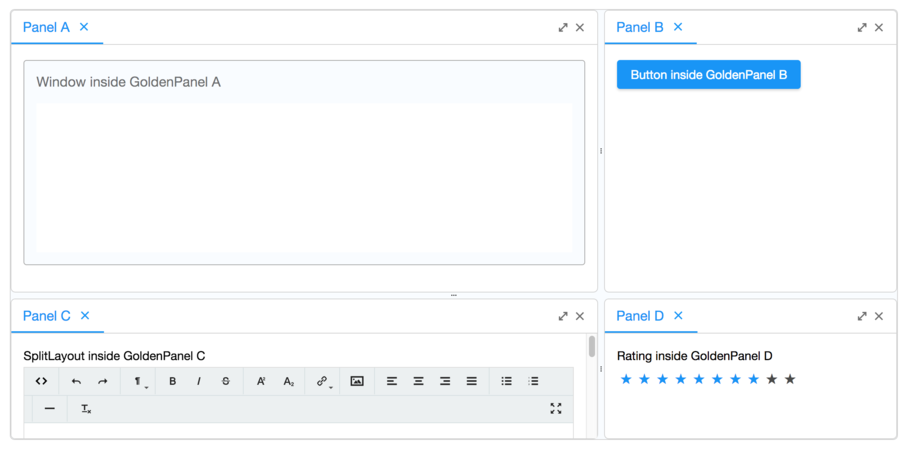
Example
    <goldenlayout vflex="1" hflex="1">
        <attribute name="areas">
            A A B
            A A B
            C C D
        </attribute>
        <goldenpanel area="A" title="Panel A">
            <window vflex="1" title="Window inside GoldenPanel A" border="normal"/>
        </goldenpanel>
        <goldenpanel area="B" title="Panel B">
            <button label="Button inside GoldenPanel B"/>
        </goldenpanel>
        <goldenpanel area="C" title="Panel C">
            <vlayout>
                SplitLayout inside GoldenPanel C
                <splitlayout hflex="1" height="500px">
                    <tbeditor vflex="1"/>
                    <window border="normal" title="Window" vflex="1"/>
                </splitlayout>
            </vlayout>
        </goldenpanel>
        <goldenpanel area="D" title="Panel D">
            <vlayout>
                Rating inside GoldenPanel D
                <rating max="10" rating="8"/>
            </vlayout>
        </goldenpanel>
    </goldenlayout>
Properties and Features
Area
The area attribute is a sugar for initializing the layout. The GoldenPanels with the same area will be stacked together with the added order. And will be placed at the position of the area in the areas attribute of it's parent GoldenLayout.
Title
The title attribute is the text on the tab of the GoldenPanel. If not specified, tab will still be rendered but with default title Panel.
Draggable
If false is specified, This GoldenPanel will not be able to dragged.
Droppable
If false is specified, No other GoldenPanel is allowed to be dropped on this GoldenPanel.
Closable
If false is specified, This GoldenPanel will not be able to be close by user action. And also the close icon will not show.
Supported Events
| Event: Event
Denotes user has activated this GoldenPanel. | |
| Event: Event
Denotes user has dropped this GoldenPanel. | |
| Event: Event
Denotes user has resized this GoldenPanel. | |
| Event: Event
Denotes user has closed this GoldenPanel. | |
| Event: Event
Denotes user has maximized this GoldenPanel. | |
| Event: Event
Denotes user has minimized this GoldenPanel. |
- Inherited Supported Events: XulElement
Supported Children
* All
Version History
| Version | Date | Content |
|---|---|---|
