Hflex and Vflex
Hflex (HtmlBasedComponent.setHflex(String)) and vflex (HtmlBasedComponent.setVflex(String)) indicate the flexibility of the component, which indicates how a component's parent distributes the remaining empty space among its children. Hflex controls the flexibility in the horizontal direction, while vflex in the vertical direction.
Flexible components grow and shrink to fit their given space. Components with larger flex values will be made larger than components with lower flex values, at the ratio determined by the two components. The actual value is not relevant unless there are other flexible components within the same container. Once the default sizes of components in a box are calculated, the remaining space in the box is divided among the flexible components, according to their flex ratios. Specifying a flex value of 0 has the same effect as leaving the flex attribute out entirely.
2 Different Underlying Implementations
Since 9.0.0
ZK 9 implements hflex/vflex in a whole new, more performant way -- by CSS3 flexbox, which is supported by modern browsers natively. With this change, javascript size calculation is eliminated thus improving the client-side performance. This change should be transparent for developers.
However, if your application depends on the previous implementation, you can fall back by the property below in zk.xml:
<library-property>
    <name>org.zkoss.zul.css.flex</name>
    <value>true</value>
</library-property>
Prerequisite: Parent Requires Width/Height Specified
Notice that, if the parent has no predefined size (width/height) (i.e., its size is decided by its children), the flexible component won't take any space. For example, the inner div (with vflex) in the following example takes no space:
<div><!--Wrong! The height is required since it is minimal height by default-->
  <datebox width="150px"/>
  <div vflex="1" style="background: yellow"/><!--height will be zero since height not specified in parent div-->
</div>
To solve it, you have to specify the height in the outer div, such as <div height="100%">, <div height="200px">, or <div vflex="1">.
Fit-the-Rest Flexibility
The simplest use of flex is to have one component to take the rest of the space of its parent (or the page, if it is the root component). For example,
<zk>
  <datebox/>
  <div vflex="1" style="background: yellow"/>
</zk>
And, the result
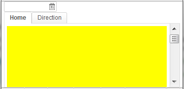
Here is another example that we'd like to grow the tabbox to fit the rest of the space:
<zk>
   <datebox/>
   <tabbox vflex="1">
      <tabs>
         <tab label="Home"/>
         <tab label="Direction"/>
      </tabs>
      <tabpanels>
         <tabpanel style="overflow: auto">
         <div height="500px" width="100%" style="background: yellow"/>
         </tabpanel>
         <tabpanel>
         </tabpanel>
      </tabpanels>
   </tabbox>
</zk>
Notice you could specify style="overflow: auto" in the tabpanel such that the scrollbar will be inside the tabbox rather than the browser window if the content is too large to fit.
Proportional Flexibility
The absolute value of the vflex/hflex is not that important. It is used to determine the proportion among flexible components. That is, you can give different integers to differentiate child components so they will take space proportionally per the given vflex/hflex value. For example,
<div width="200px" height="50px">
	<div style="background: blue" vflex="1" hflex="1"/>
	<div style="background: yellow" vflex="2" hflex="1"/>
</div>
And, the result is
Here is another example (hflex):
<hlayout width="200px">
	<div style="background: blue" hflex="1">1</div>
	<div style="background: yellow" hflex="2">2</div>
</hlayout>
Minimum Flexibility
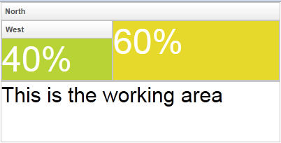
Sometimes, you might wish that the parent component's size is determined by its children. Or I shall say, the size of the parent component is just high/wide enough to hold all of its child components. We also support that. Just specify vflex/hflex="min".
<borderlayout height="200px" width="400px">
	<north title="North" vflex="min">
		<borderlayout vflex="min">
			<west title="West" size="40%" flex="true" vflex="min">
				<div style="background:#B8D335">
					<label value="40%" style="color:white;font-size:50px"/>
				</div>
			</west>
			<center flex="true" vflex="min">
				<div style="background:#E6D92C">
					<label value="60%" style="color:white;font-size:50px"/>
				</div>
			</center>
		</borderlayout>
	</north>
	<center>
		<label value="This is the working area"
			style="font-size:30px" />
	</center>
</borderlayout>
As you can see, the height of the north region of the outer borderlayout is determined by its child borderlayout. And the height of the inner borderlayout, in this example, is determined by the height of its west child region.
Also notice that the flex property (LayoutRegion.setFlex(boolean)) is unique to borderlayout (north and others). Don't confuse it with hflex or vflex.
Don't specify Minimum on a parent and 1 on a child
Because min means "calculate the size by its children" and 1 means "calculates the size by its parent", this configuration will make 2 components' size calculation depends on each other and get 0 finally. But there are workarounds, please read the following sections.
Component width within Vlayout/Vbox using minimum hflex
since 6.5.2
In the case below, we see nothing for the incorrect usage (min on the parent - vlayout, 1 on the child - div):
<vlayout hflex="min" height="30px">
    <div hflex="1" vflex="1" style="background: yellow"></div>
</vlayout>
However, in the case below, because one of the children, red div has a fixed width, vlayout can determine its width. So that yellow div can also determine its width upon its parent, which is 150px.
Component height within Hlayout/Hbox using minimum vflex
since 6.5.2
Normally, if the siblings of yellow div that have been defined height correctly, that yellow div height should be equal to the max height of siblings, which is 30px in the following sample.
However, in the following use case, we should see nothing as it is an incorrect usage:
<hlayout width="100px" vflex="min">
    <div hflex="1" vflex="1" style="background: yellow"></div>
</hlayout>
Grid's Column and Flexibility
If hflex is specified in the header of grid, listbox and tree, it is applied to the whole column (including the header and contents).
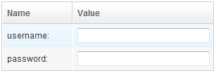
For example, we could assign 33% to the first column and 66% to the second as follows.
<grid width="300px">
	<columns>
		<column label="Name" hflex="1"/>
		<column label="Value" hflex="2"/>
	</columns>
	<rows>
		<row>username:<textbox hflex="1"/></row>
		<row>password:<textbox hflex="1"/></row>
	</rows>
</grid>
The result is
Notice that we also specify hflex="1" to the textbox, so it will take up the whole space.
Alignment
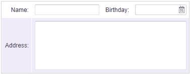
When we create a form, we will put some input elements in a Grid. We can set hflex="min" to Grid and each Column for keep Grid with minimal size.
If we need the Datebox's width the same with Textbox, we can specify hflex="1" to Datebox.
Cell colspan
Sometimes we need to put some elements in cross column, we can put it in a Cell and set hflex="1" to the element.
For a complete list of controls that you could apply to the columns of grid, listbox and tree, please refer to ZK Developer's Reference/UI Patterns/Grid's Columns and Hflex.
Flexibility versus Percentage
The use of hflex and vflex is similar to the use of percentage in width and height. For example,
<div width="200px" height="200px">
	<div height="33%" style="background: blue">1</div>
	<div height="66%" style="background: yellow">2</div>
</div>
The advantage of percentage is that the performance will be a little better, since it is done by the browser. However, hflex and vflex are recommended because of the following issues:
- The use of 100% will cause overflow (and then scrollbar appears if overflow:auto), if padding is not zero. Moreover, some browsers might show mysterious scrollbars or overflow the parent's space even if padding is zero.
- The percentage does not work, if any of the parent DOM element does not specify the width or height.
- The percentage does not support take-the-rest-space. For example, the following doesn't work:
<!-- a vertical scrollbar appear (not as expected) -->
<div height="100%">
	<datebox/>
	<div height="100%"/>
</div>
Body Height and Padding
By default, ZK's theme configures the document's BODY tag as follows.
body {
    height: 100%;
    padding: 0 5px;
}
Sometimes you might prefer to add some padding vertically, but it cannot be done by changing BODY's styling as follows.
body {
    height: 100%;
    padding: 5px; /* WRONG! It causes vertical scrollbar to appear since the 100% height is used with vertical padding */
}
As described in the previous section, a vertical scrollbar will appear, since both the vertical padding and the 100% height are specified.
Solution: you shall not change the default CSS styling of BODY. Rather, you could enclose the content with the div component, and then specify vflex="1" and the padding to the div component. For example,
<div style="padding: 5px 0" vflex="1">
	<grid>
		<rows>
			<row>aaa</row>
		</rows>
	</grid>
</div>
Flexibility and Resizing
Vflex and hflex support resizing. If the parent component or the browser window changes its size to increase or decrease the extra space, the child components with vflex/hflex will recalculate themselves to accommodate the new size.
<zk>
	<zscript><![CDATA[
		int[] str = new int[100];
		for(int i=0;i<100;i++){
			str[i]=i;
		}
	]]></zscript>

	<div height="100%" width="300px">
		Top of the Tree
		<tree vflex="1">
			<treechildren>
				<treeitem forEach="${str}" label="item${each}"/>
			</treechildren>
		</tree>
		<tree vflex="2">
			<treechildren>
				<treeitem forEach="${str}" label="item${each}"/>
			</treechildren>
		</tree>
		Bottom of the Tree
	</div>
</zk>
Note that the height proportion between the two trees are always 1 : 2, when we change the browser height.
Limitations
Span Ignores Width and Height
Span ignores the width and height, so hflex and vflex has no effect on them (unless you specify display:block -- but it makes it div eventually).
<!-- this example does not work -->
<div width="200px">
	<span style="background: blue" hflex="1">1</span>
	<span style="background: yellow" hflex="2">2</span>
</div>
And, the result is as follows - the width has no effect:
This limitation can be solved by the use of hlayout and div as follows.
<!-- this is correct -->
<hlayout width="200px">
	<div style="background: blue" hflex="1">1</div>
	<div style="background: yellow" hflex="2">2</div>
</hlayout>
Hflex Must Align Correctly
Hflex will be wrong if a component is not aligned in the same row with its siblings. For example,
<div width="200px">
  <div style="background: blue" hflex="1">1</div><!-- not work since it won't be aligned with sibling div -->
  <div style="background: yellow" hflex="2">2</div>
</div>
As shown below, the second div is not aligned vertically with the first div, so is the width not as expected:
This limitation can be solved by use of hlayout and div as show in the previous subsection.
Input elements have incorrect margin values in WebKit browsers
In WebKit browsers (Chrome, Safari), the left and right margin values of an input element are considered 2px by browsers, where they are really 0px on screen. This may cause hflex wrongly handle InputElements like textbox, intbox, etc. For example, in the following case the Textbox does not occupy the entire Div width in Chrome:
	<div width="300px" style="border: 1px solid green">
		<textbox hflex="1" />
	</div>
You can work around this by specifying Textbox margin to be 0:
	<style>
		input.nomargin {
			margin-left: 0;
			margin-right: 0;
		}
	</style>
	<div width="300px" style="border: 1px solid green">
		<textbox sclass="nomargin" hflex="1" />
	</div>
Minimum Flexibility Doesn't Change a Component's Size Dynamically
Basically, you can change the h/vflex dynamically. However, minimum hflex/vflex only calculates a component's size at the page creation, thus, if you want to change h/vflex to min dynamically, please use Clients.resize(Component) API.
The same rule applies when you change the content of a parent component with minimum hflex/vflex, the parent component doesn't resize itself upon its content. You can need to call resize().
For example,
<zk>
	<div id="div" vflex="1" hflex="1" style="background: blue">blue</div>
	<button label="vflex to min">
		<attribute name="onClick"><![CDATA[
			div.setVflex("min");
			Clients.resize(div);
		]]></attribute>
	</button>
</zk>
Version History
| Version | Date | Content |
|---|---|---|


