Menupopup"
From Documentation
Tmillsclare (talk | contribs) |
Jumperchen (talk | contribs) |
||
| Line 23: | Line 23: | ||
= Example = | = Example = | ||
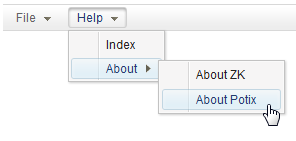
| − | [[Image: | + | [[Image:ZKComRef_Menubar.png]] |
| Line 51: | Line 51: | ||
</menubar> | </menubar> | ||
</source> | </source> | ||
| − | |||
| − | |||
| − | |||
=Supported events= | =Supported events= | ||
Revision as of 04:33, 16 November 2010
Menupopup
Employment/Purpose
A container used to display menus. It should be placed inside a Menu.
Supported event: onOpen.
Note: to have better performance, onOpen is sent only if non-deferrable event listener is registered (see Deferrable).
To load the content dynamically, you can listen to the onOpen event, and then create menuitem when OpenEvent.isOpen() is true.
Default HtmlBasedComponent.getSclass(): menupopup.
Example
<menubar id="menubar">
	<menu label="File">
		<menupopup onOpen="alert(self.id)">
			<menuitem label="New" onClick="alert(self.label)" />
			<menuitem label="Open" onClick="alert(self.label)" />
			<menuitem label="Save" onClick="alert(self.label)" />
			<menuseparator />
			<menuitem label="Exit" onClick="alert(self.label)" />
		</menupopup>
	</menu>
	<menu label="Help">
		<menupopup>
			<menuitem label="Index" onClick="alert(self.label)" />
			<menu label="About">
				<menupopup>
					<menuitem label="About ZK" onClick="alert(self.label)" />
					<menuitem label="About Potix" onClick="alert(self.label)" />
				</menupopup>
			</menu>
		</menupopup>
	</menu>
</menubar>
Supported events
| OpenEvent
Description: Denotes user has opened or closed a component. |
Supported Children
* Menu , Menuitem , Menuseparator
Use cases
Version History
| Version | Date | Content |
|---|---|---|
