Windows"
m (correct highlight (via JWB)) |
|||
| (2 intermediate revisions by 2 users not shown) | |||
| Line 5: | Line 5: | ||
A window is similar to a HTML DIV tag and is used to group components. Unlike other components, a window has the following characteristics: | A window is similar to a HTML DIV tag and is used to group components. Unlike other components, a window has the following characteristics: | ||
| − | * A window is an owner of an ID space. Any component contained in a window, including itself, could be found by use of the < | + | * A window is an owner of an ID space. Any component contained in a window, including itself, could be found by use of the <code>getFellow</code> method if it is assigned with an identifier. |
* A window can be overlapped, popped-up and embedded. | * A window can be overlapped, popped-up and embedded. | ||
* A window can be a modal dialog. | * A window can be a modal dialog. | ||
=== Titles and Captions === | === Titles and Captions === | ||
| − | A window might have a title, a caption and a border. The title is specified by the < | + | A window might have a title, a caption and a border. The title is specified by the <code>title</code> attribute. The caption is specified by declaring a child component called <code>caption</code>. All children of the <code>caption</code> component will appear on right hand side of the title. |
[[Image:10000000000001640000004CEB4969A9.png]] | [[Image:10000000000001640000004CEB4969A9.png]] | ||
| Line 48: | Line 48: | ||
=== The closable Property === | === The closable Property === | ||
| − | By setting the < | + | By setting the <code>closable</code> attribute to true, a close button is shown for the window, which enables a to close the window by clicking the button. Once user clicks on the <code>close</code> button, an <code>onClose</code> event is sent to the window which is processed by the <code>onClose</code> method of the <code>Window</code> component. Then, <code>onClose</code>, by default, detaches the window itself. |
You can override it to do whatever you want. Or, you can register your own listener to change the default behavior. For example, you might choose to hide the window rather than close it. | You can override it to do whatever you want. Or, you can register your own listener to change the default behavior. For example, you might choose to hide the window rather than close it. | ||
| Line 63: | Line 63: | ||
</source> | </source> | ||
| − | Notice that < | + | Notice that <code>event.stopPropagation()</code> must be called to prevent Window.onClose() being called. |
| − | '''Tip''': If the window is a popup, the < | + | '''Tip''': If the window is a popup, the <code>onOpen</code> event will be sent to the window with open=false, when the popup is closed due to the user clicking outside of the window, or pressing <code>ESC</code>. |
| − | The < | + | The <code>onClose</code> is sent to ask the server to detach or to hide the window. By default, the window is detached. Of course, the application can override this behaviour and do whatever it wants as described above. |
| − | On the other hand, < | + | On the other hand, <code>onOpen</code> is a notification. It is sent to notify the application that the client has hidden the window. The application cannot prevent it from hiding, or change the behavior to be detached. |
=== The sizable Property === | === The sizable Property === | ||
| − | If you allow users to resize the window, you can set the < | + | If you allow users to resize the window, you can set the <code>sizable</code> attribute to true as follows. |
<source lang="xml" > | <source lang="xml" > | ||
| Line 85: | Line 85: | ||
==== The onSize Event ==== | ==== The onSize Event ==== | ||
| − | Once a user resizes the window, the < | + | Once a user resizes the window, the <code>onSize</code> event is sent with an instance of the <javadoc>org.zkoss.zul.event.SizeEvent</javadoc>. Notice that the window is resized before the<code> onSize</code> event is sent. In other words, the event serves as a notification that you generally ignore. Of course, you can do whatever you want in the event listener. |
| − | '''Note''': If the user drags the upper or left border, the < | + | '''Note''': If the user drags the upper or left border, the <code>onMove</code> event is also sent since the position has changed, too. |
=== The contentStyle Property === | === The contentStyle Property === | ||
| − | You can customize the look and feel of window』s content block by specifying the < | + | You can customize the look and feel of window』s content block by specifying the <code>contentStyle</code> property. |
[[Image:10000000000000CB0000003292CB8174.png]] | [[Image:10000000000000CB0000003292CB8174.png]] | ||
| Line 105: | Line 105: | ||
==== Scrollable Window ==== | ==== Scrollable Window ==== | ||
| − | A typical use of the < | + | A typical use of the <code>contentStyle</code> attribute is to make a window scrollable as follows. |
[[Image:100000000000009C0000006819656516.png]] | [[Image:100000000000009C0000006819656516.png]] | ||
| Line 120: | Line 120: | ||
=== Borders === | === Borders === | ||
| − | The < | + | The <code>border</code> attribute specifies whether to display a border for window. The default style sheets support only <code>normal</code> and <code>none</code>. The default value is <code>none</code>. |
Of course, you can provide an additional style class. For example, | Of course, you can provide an additional style class. For example, | ||
| Line 139: | Line 139: | ||
</source> | </source> | ||
| − | < | + | <code>wc-embedded-dash</code> defines the style of the inner box of the window. The style class is named by concatenating <code>wc<ref name="ftn37">, <code>wc</code> standing for window content, while <code>wt</code> stands for window title.</ref>, the <code>sclass</code> property and the <code>border</code> property together and separating them with dash (-). In this example, <code>sclass</code> is <code>embedded</code> since it is an embedded window and no explicit <code>sclass</code> is assigned (so the default <code>sclass</code> is used). |
=== Overlapped, Popup, Modal, Highlighted and Embedded === | === Overlapped, Popup, Modal, Highlighted and Embedded === | ||
| − | A window could be in one of five different modes: overlap, popup, modal, highlighted and embedded. The default mode is the embedded mode. You can change the mode by use of the < | + | A window could be in one of five different modes: overlap, popup, modal, highlighted and embedded. The default mode is the embedded mode. You can change the mode by use of the <code>doOverlapped</code>, <code>doPopup</code>, <code>doModal</code>, <code>doHighlighted</code>, and <code>doEmbedded</code> methods, depicted as follows. |
<source lang="xml" > | <source lang="xml" > | ||
| Line 165: | Line 165: | ||
==== Overlapped ==== | ==== Overlapped ==== | ||
| − | An overlapped window can be overlapped by other components, such that users are able to drag it around and the developer can set its position using < | + | An overlapped window can be overlapped by other components, such that users are able to drag it around and the developer can set its position using <code>setLeft</code> and <code>setTop</code> methods. |
| − | In addition to < | + | In addition to <code>doOverlapped</code>, you can use the <code>mode</code> property as follows. |
<source lang="xml" > | <source lang="xml" > | ||
| Line 178: | Line 178: | ||
==== Modal ==== | ==== Modal ==== | ||
| − | A modal window (aka. a modal dialog) is similar to overlapped windows, except it suspends the execution until one of the < | + | A modal window (aka. a modal dialog) is similar to overlapped windows, except it suspends the execution until one of the <code>endModal</code>, <code>doEmbedded</code>, <code>doOverlapped</code>, <code>doHighlighted</code>, or <code>doPopup</code> methods is called. |
In addition to suspending the execution, it disables components not belonging to the modal window. | In addition to suspending the execution, it disables components not belonging to the modal window. | ||
| Line 187: | Line 187: | ||
A highlighted window is similar to the overlapped windows, except the visual effect is the same as the modal windows. In other words, a highlighted window is positioned at the center of the browsers, and components not belonging to the highlighted window are disabled. | A highlighted window is similar to the overlapped windows, except the visual effect is the same as the modal windows. In other words, a highlighted window is positioned at the center of the browsers, and components not belonging to the highlighted window are disabled. | ||
| − | However, it does ''not'' suspend the execution. Like the overlapped windows, the execution continues to the next statement once the mode is changed. For example, < | + | However, it does ''not'' suspend the execution. Like the overlapped windows, the execution continues to the next statement once the mode is changed. For example, <code>f1()</code> is called only after <code>win1</code> is closed, while <code>g()</code> is called immediately after <code>win2</code> becomes highlighted. |
<source lang="java" > | <source lang="java" > | ||
| Line 200: | Line 200: | ||
==== Modal Windows and Event Listeners ==== | ==== Modal Windows and Event Listeners ==== | ||
| − | Unlike other modes, you can ''only'' put a window in ''modal'' mode in an event listener. This mean, you can only invoke < | + | Unlike other modes, you can ''only'' put a window in ''modal'' mode in an event listener. This mean, you can only invoke <code>doModal()</code> or <code>setMode("modal")</code> in an event listener. In another words, modal windows can only be displayed on some event for eg. onClick of button or onSelect of Listbox. You can not show a modal Window when the ZUL page is rendered. (You can do it via a technique demonstrated in t3.zul as shown below) |
<source lang="xml" > | <source lang="xml" > | ||
| Line 210: | Line 210: | ||
</zk> | </zk> | ||
</source> | </source> | ||
| − | In above sample, the < | + | In above sample, the <code>wnd</code> Window initially is invisible. However clicking on <code>do it</code> Button will open <code>wnd</code> Window as a Modal dialog. |
On the other hand, the following is wrong if it executes in ''the Component Creation Phase<ref name="ftn38">''Please refer to the '''Component Lifecycle''' chapter.''</ref>. | On the other hand, the following is wrong if it executes in ''the Component Creation Phase<ref name="ftn38">''Please refer to the '''Component Lifecycle''' chapter.''</ref>. | ||
| Line 220: | Line 220: | ||
</source> | </source> | ||
| − | [[Image:10000000000005110000034A677D3288.png]] | + | |
| + | ---- | ||
| + | '''Below is expected result of t1.zul after opening it in browser''' | ||
| + | |||
| + | ---- | ||
| + | |||
| + | |||
| + | [[Image:10000000000005110000034A677D3288.png|600px]] | ||
| + | |||
| + | |||
| + | ---- | ||
It will cause the following result<ref name="ftn39">Assume Tomcat is used.</ref> if you directly go to it. | It will cause the following result<ref name="ftn39">Assume Tomcat is used.</ref> if you directly go to it. | ||
| Line 237: | Line 247: | ||
</source> | </source> | ||
| − | If you need to create a modal window in the page loading event, you can post the < | + | If you need to create a modal window in the page loading event, you can post the <code>onModal</code> event as follows. |
//t3.zul | //t3.zul | ||
| Line 250: | Line 260: | ||
</source> | </source> | ||
| − | '''Note''': the following codes execute correctly even if < | + | '''Note''': the following codes execute correctly even if <code>t1.zul</code> sets the window's mode to modal directly (as shown above). Why? It executes in an event listener (for <code>onClick</code>). |
<source lang="xml" > | <source lang="xml" > | ||
| Line 264: | Line 274: | ||
=== The position Property === | === The position Property === | ||
| − | In addition to the < | + | In addition to the <code>left</code> and <code>top</code> properties, you can control the position of an overlapped/popup/modal window by use of the <code>position</code> attribute. For example, the following code snippet positions the window to the right-bottom corner. |
<source lang="xml" > | <source lang="xml" > | ||
| Line 271: | Line 281: | ||
</source> | </source> | ||
| − | The value of the < | + | The value of the <code>position</code> attribute can be a combination of the following constants by separating them with comma (<code>,</code>). |
| Line 280: | Line 290: | ||
|- | |- | ||
| <center>center</center> | | <center>center</center> | ||
| − | | Position the window at the center. If < | + | | Position the window at the center. If <code>left</code> or <code>right</code> is also specified, it means the vertical center. If <code>top</code> or <code>bottom</code> is also specified, it means the horizontal center. If none of <code>left</code>, <code>right</code>, <code>top</code> and <code>bottom</code> is specified, it means the center in both directions. |
| − | Both the < | + | Both the <code>left</code> and <code>top</code> property are ignored. |
|- | |- | ||
| Line 288: | Line 298: | ||
| Position the window at the left edge. | | Position the window at the left edge. | ||
| − | The < | + | The <code>left</code> property is ignored. |
|- | |- | ||
| Line 294: | Line 304: | ||
| Position the window at the right edge. | | Position the window at the right edge. | ||
| − | The < | + | The <code>left</code> property is ignored. |
|- | |- | ||
| Line 300: | Line 310: | ||
| Position the window at the top. | | Position the window at the top. | ||
| − | The < | + | The <code>top</code> property is ignored. |
|- | |- | ||
| Line 306: | Line 316: | ||
| Position the window at the bottom. | | Position the window at the bottom. | ||
| − | The < | + | The <code>top</code> property is ignored. |
|} | |} | ||
| − | By default, its value is null. That is, the overlapped and popup window is positioned by the < | + | By default, its value is null. That is, the overlapped and popup window is positioned by the <code>left</code> and <code>top</code> properties, while the modal window is positioned at the center. |
=== Common Dialogs === | === Common Dialogs === | ||
Latest revision as of 10:44, 19 January 2022
 This documentation is for an older version of ZK. For the latest one, please click here.
A window is similar to a HTML DIV tag and is used to group components. Unlike other components, a window has the following characteristics:
- A window is an owner of an ID space. Any component contained in a window, including itself, could be found by use of the
getFellowmethod if it is assigned with an identifier. - A window can be overlapped, popped-up and embedded.
- A window can be a modal dialog.
Titles and Captions
A window might have a title, a caption and a border. The title is specified by the title attribute. The caption is specified by declaring a child component called caption. All children of the caption component will appear on right hand side of the title.

<zk>
	<window title="Demo" border="normal" width="350px">
		<caption>
			<toolbarbutton label="More" />
			<toolbarbutton label="Help" />
		</caption>
		<toolbar>
			<toolbarbutton label="Save" />
			<toolbarbutton label="Cancel" />
		</toolbar>
		What is your favorite framework?
		<radiogroup>
			<radio label="ZK" />
			<radio label="JSF" />
		</radiogroup>
	</window>
</zk>
You are also able to specify a label and an image within a caption, and then the appearance is as follows.

<zk>
	<window id="win" title="Main" border="normal" width="200px">
	    <caption image="/images/ZK-Logo.PNG" label="Hi there!"/>
	    <checkbox label="Hello, World!"/>
	</window>
</zk>
The closable Property
By setting the closable attribute to true, a close button is shown for the window, which enables a to close the window by clicking the button. Once user clicks on the close button, an onClose event is sent to the window which is processed by the onClose method of the Window component. Then, onClose, by default, detaches the window itself.
You can override it to do whatever you want. Or, you can register your own listener to change the default behavior. For example, you might choose to hide the window rather than close it.

<zk>
	<window closable="true" title="Detach on Close" border="normal" width="200px"
 		onClose="self.visible = false; event.stopPropagation();">
     In this example, this window hides itself when the close button is clicked.
	</window>
</zk>
Notice that event.stopPropagation() must be called to prevent Window.onClose() being called.
Tip: If the window is a popup, the onOpen event will be sent to the window with open=false, when the popup is closed due to the user clicking outside of the window, or pressing ESC.
The onClose is sent to ask the server to detach or to hide the window. By default, the window is detached. Of course, the application can override this behaviour and do whatever it wants as described above.
On the other hand, onOpen is a notification. It is sent to notify the application that the client has hidden the window. The application cannot prevent it from hiding, or change the behavior to be detached.
The sizable Property
If you allow users to resize the window, you can set the sizable attribute to true as follows.
<zk>
	<window id="win" title="Sizable Window" border="normal" width="200px" sizable="true">
	    This is a sizable window.
	    <button label="Change Sizable" onClick="win.sizable = !win.sizable"/>
	</window>
</zk>
Once allowed, users can resize the window by dragging the borders.
The onSize Event
Once a user resizes the window, the onSize event is sent with an instance of the SizeEvent. Notice that the window is resized before the onSize event is sent. In other words, the event serves as a notification that you generally ignore. Of course, you can do whatever you want in the event listener.
Note: If the user drags the upper or left border, the onMove event is also sent since the position has changed, too.
The contentStyle Property
You can customize the look and feel of window』s content block by specifying the contentStyle property.

<zk>
	<window title="My Window" border="normal" width="200px" contentStyle="background:yellow">
		Hello, World!
	</window>
</zk>
Scrollable Window
A typical use of the contentStyle attribute is to make a window scrollable as follows.

<zk>
	<window id="win" title="Hi" width="150px" height="100px" contentStyle="overflow:auto" border="normal">
		 This is a long line wrapped over several lines, and more content to display.
		 Finally, the scrollbar becomes visible.
		 This is another line.
	</window>
</zk>
Borders
The border attribute specifies whether to display a border for window. The default style sheets support only normal and none. The default value is none.
Of course, you can provide an additional style class. For example,

<zk>
    <style>
		div.wc-embedded-dash {
		padding: 2px; border: 3px dashed #aab;
		}
    </style>
    <window title="My Window" border="dash" width="200px">
		Hello, World!
    </window>
</zk>
wc-embedded-dash defines the style of the inner box of the window. The style class is named by concatenating wc[1], the sclass property and the border property together and separating them with dash (-). In this example, sclass is embedded since it is an embedded window and no explicit sclass is assigned (so the default sclass is used).
Overlapped, Popup, Modal, Highlighted and Embedded
A window could be in one of five different modes: overlap, popup, modal, highlighted and embedded. The default mode is the embedded mode. You can change the mode by use of the doOverlapped, doPopup, doModal, doHighlighted, and doEmbedded methods, depicted as follows.
<zk>
    <window id="win" title="Hi!" border="normal" width="200px">
        <caption>
            <toolbarbutton label="Close" onClick="win.setVisible(false)"/>
        </caption>
        <checkbox label="Hello, Wolrd!"/>
    </window>

    <button label="Overlap" onClick="win.doOverlapped();"/>
    <button label="Popup" onClick="win.doPopup();"/>
    <button label="Modal" onClick="win.doModal();"/>
    <button label="Embed" onClick="win.doEmbedded();"/>
    <button label="Highlighted" onClick="win.doHighlighted();"/>
</zk>
Embedded
An embedded window is placed in line with other components. In this mode, you cannot change its position, since the position is decided by the browser.
Overlapped
An overlapped window can be overlapped by other components, such that users are able to drag it around and the developer can set its position using setLeft and setTop methods.
In addition to doOverlapped, you can use the mode property as follows.
<window title="My Overlapped" width="300px" mode="overlapped">
</window>
Popup
A popup window is similar to overlapped windows, except it is automatically closed when user clicks on any component other than the popup window itself or any of its descendants. As its』 name suggests, it is designed to implement popup windows.
Modal
A modal window (aka. a modal dialog) is similar to overlapped windows, except it suspends the execution until one of the endModal, doEmbedded, doOverlapped, doHighlighted, or doPopup methods is called.
In addition to suspending the execution, it disables components not belonging to the modal window.
A modal window is positioned automatically at the center of the browser, so you cannot control its position.
Highlighted
A highlighted window is similar to the overlapped windows, except the visual effect is the same as the modal windows. In other words, a highlighted window is positioned at the center of the browsers, and components not belonging to the highlighted window are disabled.
However, it does not suspend the execution. Like the overlapped windows, the execution continues to the next statement once the mode is changed. For example, f1() is called only after win1 is closed, while g() is called immediately after win2 becomes highlighted.
win1.doModal(); //the execution is suspended until win1 is closed
f1();

win2.doHighlighted(); //the execution won't be suspended
g1()
The highlighted window is aimed to substitute the modal window, if you prefer not to use or suspend the event processing thread. Refer to the Use the Servlet Thread to Process Events section in the Advanced Features chapter.
Modal Windows and Event Listeners
Unlike other modes, you can only put a window in modal mode in an event listener. This mean, you can only invoke doModal() or setMode("modal") in an event listener. In another words, modal windows can only be displayed on some event for eg. onClick of button or onSelect of Listbox. You can not show a modal Window when the ZUL page is rendered. (You can do it via a technique demonstrated in t3.zul as shown below)
<zk>
    <window id="wnd" title="My Modal" visible="false" width="300px">
        <button label="close" onClick="wnd.visible = false"/>
    </window>
    <button label="do it" onClick="wnd.doModal()"/>
</zk>
In above sample, the wnd Window initially is invisible. However clicking on do it Button will open wnd Window as a Modal dialog.
On the other hand, the following is wrong if it executes in the Component Creation Phase[2].
//t1.zul
<window title="My Modal" width="300px" closable="true" mode="modal">
</window>
Below is expected result of t1.zul after opening it in browser
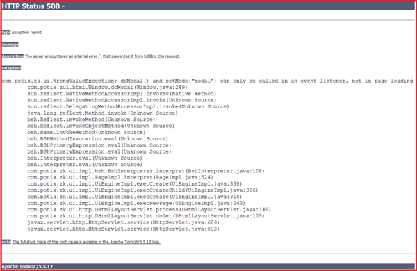

It will cause the following result[3] if you directly go to it.
The following code will cause the same result.
//t2.zul
<zk>
	<window title="My Modal" width="300px" closable="true">
		<zscript>
			self.doModal();
		</zscript>
	</window>
</zk>
If you need to create a modal window in the page loading event, you can post the onModal event as follows.
//t3.zul
<zk>
	<window title="My Modal" width="300px" closable="true">
	    <zscript>
			Events.postEvent("onModal", self, null);
	    </zscript>
	</window>
</zk>
Note: the following codes execute correctly even if t1.zul sets the window's mode to modal directly (as shown above). Why? It executes in an event listener (for onClick).
<zk>
	<button label="do it">
		<attribute name="onClick">
			Executions.createComponents("t1.zul", null, null);
			//it loads t1.zul in this event listener for onClick
		</attribute>
	</button>
</zk>
The position Property
In addition to the left and top properties, you can control the position of an overlapped/popup/modal window by use of the position attribute. For example, the following code snippet positions the window to the right-bottom corner.
<window width="300px" mode="overlapped" position="right,bottom">
 ...
The value of the position attribute can be a combination of the following constants by separating them with comma (,).
Constant

Description


center

Position the window at the center. If left or right is also specified, it means the vertical center. If top or bottom is also specified, it means the horizontal center. If none of left, right, top and bottom is specified, it means the center in both directions.
Both the left and top property are ignored.


left

Position the window at the left edge.
The left property is ignored.


right

Position the window at the right edge.
The left property is ignored.


top

Position the window at the top.
The top property is ignored.


bottom

Position the window at the bottom.
The top property is ignored.
By default, its value is null. That is, the overlapped and popup window is positioned by the left and top properties, while the modal window is positioned at the center.
Common Dialogs
The XUL component set supports the following common dialogs to simplify some common tasks.