Tooltips, Context Menus and Popups"
m (→Tooltips) |
|||
| Line 32: | Line 32: | ||
<zk> | <zk> | ||
<image src="/img/earth.png" tooltip="msg"/> | <image src="/img/earth.png" tooltip="msg"/> | ||
| + | |||
<menupopup id="msg"> | <menupopup id="msg"> | ||
<menuitem label="Undo"/> | <menuitem label="Undo"/> | ||
Revision as of 09:45, 21 December 2010
The support of tooltips, context menus and popups are generic. Any component inherited from XulElement can handle them in the same way.
To enable any of them, you have to prepare a component representing the customized look, and then specify this component or its ID in the corresponding properties (such as XulElement.setTooltip(String)) in the target component. Then, when the user triggers it (such as moving the mouse over the target component), the component representing the customized look is shown up.
The component representing the customized look must be a Popup component or one of derives, such as Menupopup, while the target component (which causes the customized look to show up) can be any kind of component.
| What | Condition | API |
|---|---|---|
| Tooltips | When the user moves the mouse point over the target component for a while | XulElement.setTooltip(String) or XulElement.setTooltip(Popup) |
| Context Menus | When the user clicks the right button on the target component | XulElement.setContext(String) or XulElement.setContext(Popup) |
| Context Menus | When the user clicks the left button on the target component | XulElement.setPopup(String) or XulElement.setPopup(Popup) |
Tooltips
To provide a custom tooltip, you could specify the ID of the custom tooltip in the target component's tooltip (XulElement.setTooltip(String) or XulElement.setTooltip(Popup)). For example,
<zk>
    <image src="/img/earth.png" tooltip="msg"/>

    <menupopup id="msg">
        <menuitem label="Undo"/>
        <menuitem label="Redo"/>
        <menu label="Sort">
            <menupopup>
                <menuitem label="Sort by Name" autocheck="true"/>
                <menuitem label="Sort by Date" autocheck="true"/>
            </menupopup>
        </menu>
    </menupopup>
</zk>
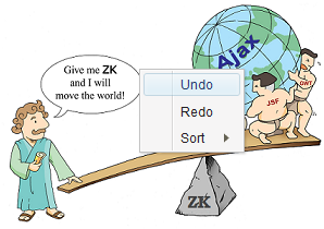
Then, when the user moves the mouse pointer over the image for a while, the menupopup will be shown up as shown below.
The time to wait before showing up the tooltip can be configured. Please refer to ZK Configuration Reference for more information.
Notice that if you'd like to have different text for the tooltip (rather than a fully customized look), you shall use HtmlBasedComponent.setTooltiptext(String) instead (which is easier to use).
Context Menus
Popups
Version History
| Version | Date | Content |
|---|---|---|
