New ZK Demo Introduction
Ryan Wu, Engineer, Potix Corporation
Jan 20, 2008
Since ZK 3.5.2
Introduction
This article is created for those who are interested in the architecture of the latest ZK Demo.
The ZK Demo is one of the most important parts of ZK's website.
In this article, I will introduce how the new demo was created and what type of ZK features was used.
You are recommended to download the source and read it with this article.
The UI Part
BorderLayout
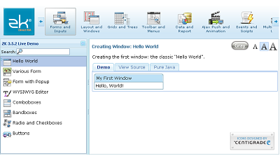
First, We create a borderlayout to construct the whole main page. It contains three parts.
- North: The category selection bar which is made by a macro components named category and a customized component, categorybar.
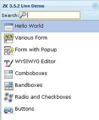
- West: The case list which we use listmodel to generate and replace the data.
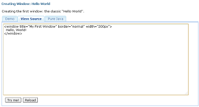
- Center: The case content. If a demo case is selected in the west list, this part will show the demo case's content and it's sourced by including the corresponding zul file. Each of them shows data in a Tabbox.
<borderlayout id="main" apply="org.zkoss.zkdemo.userguide.MainLayoutComposer">
  <north border="none" size="100px" sclass="demo-header" collapsible="true">
    ...
  </north>
  <west title="ZK ${desktop.webApp.version} Live Demo" size="250px" flex="true" splittable="true"
    minsize="210" maxsize="500" collapsible="true">
    ...
  </west>
  <center autoscroll="true" flex="true">
    ...
  </center>
</borderlayout>
- Namespace
- BorderLayout : main
You might be confused why the borderlayout(main) could have some special functions, for example
- <category forEach="${main.categories}" />
- <listbox model="${main.selectedModel}" ></listbox>
Let's take a look at the composer[1] of borderlayout, MainLayoutComposer. We used the FusionInvoker[2] and bind the composer object to original borderlayout, main.
public class MainLayoutComposer extends GenericForwardComposer implements MainLayoutAPI, ComposerExt {
  /*...*/
  public void doBeforeComposeChildren(Component comp) throws Exception {
    bindComponent(comp);
    Object obj = FusionInvoker.newInstance(new Object[] { comp, this });
    comp.setVariable("main", obj, true);
    main = (Borderlayout) comp;
  }
  /*...*/
}
The Category Bar

Categorybar
This is a customized component, which extend the Div component. We created it and used forEach to load the categories. When the screen size is less than the width of the categories, users can use the scroll button and scroll to the hidden categories.
The client side function is written in the index.zul with a JavaScript Class zkCategoryBar.
zkCategoryBar = {
  init: function (cmp) { ... },
  onSize: function (cmp) { ... },
  _forceStyle: function (cmp, value) { ... },
  _isLegalType: function (n) { ... },
  _checkScrolling: function (cmp, body) { ... },
  _fixButton : function(cmp) { ... },
  onScrollTo: function (cmp) { ... },
  onClickArrow: function (evt) { ... },
  stop: function () { .. },
  scroll: function(cmp, move, btn, isRight, stopPropagate) { ... },
  goscroll: function(body, isRight, step) { ... }
};
The categorybar's code is in /userguide/macros/categorybar.dsp
<%@ taglib uri="http://www.zkoss.org/dsp/web/core" prefix="c" %>
<%@ taglib uri="http://www.zkoss.org/dsp/zk/core" prefix="z" %>
<c:set var="self" value="${requestScope.arg.self}"/>
<c:set var="uuid" value="${self.uuid}"/>
<div id="${uuid}" z.type="CategoryBar" ${self.outerAttrs}${self.innerAttrs}>
<div id="${uuid}!right"></div>
<div id="${uuid}!left"></div>
  <div id="${uuid}!body" class="${self.zclass}-body">
  <div id="${uuid}!cave">
    <c:forEach var="child" items="${self.children}">${z:redraw(child, null)}</c:forEach>
    <div class="z-clear"></div>
   </div>
  </div>
</div>
For more information or guide about creating customized components in ZK, please refer to ZK Component Development Essentials.
We first define the categorybar, and use it in the index.zul.
<?component name="categorybar" extends="div" moldURI="/userguide/macros/categorybar.dsp"?>
...
<categorybar zclass="demo-categorybar" id="header">
  <category forEach="${main.categories}" id="${each.id}" src="${each.icon}" label="${each.label}"/>
</categorybar>
The main.categories reflect to the composer's getCategories(). It will load the categories form zkdemo.properties.
public Category[] getCategories() {
  return (Category[]) getCategoryMap().values().toArray(new Category[] {});
}
private Map getCategoryMap() {
  return DemoWebAppInit.getCateMap();
}
The DemoWebAppInit is the java class use to load the property file - zkdemo.properties
public class DemoWebAppInit implements WebAppInit {
  private static final Log log = Log.lookup(DemoWebAppInit.class);
  final static String PATH = "/userguide/";
  final static String CONFIG = "zkdemo.properties";
  final static String CATEGORY_TYPE = "CATEGORY";
  final static String LINK_TYPE = "LINK";
  private static Map _cateMap = new LinkedHashMap () { ... };
  public void init(WebApp wapp) throws Exception { ... }
  static Map getCateMap() { ... }
  private void loadProperites(ServletContext context) { ... }
}
Category
This is an macro components, which will show as an icon. (The data of categories was loaded from DemoWebAppInit.)
<div id="${arg.id}" style="" sclass="demo-category pointer" forward="main.onCategorySelect"
  action="onmouseover:zk.addClass(this, 'demo-over'); onmouseout:zk.rmClass(this, 'demo-over'); onclick:if(zkau.insamepos(event)) onSelect(this)">
  <image sclass="demo-category-img" tooltiptext="${arg.label}" src="${arg.src}" action="onmousedown:return false;"/>
  <separator height="1px"/>
  <label sclass="demo-category-text" value="${arg.label}"/>
</div>
It will forward[3] the select event to composer's onCategorySelect().
We create a Category class to save data.
org.zkoss.zkdemo.userguide.Category
public class Category {
  private String _id;
  private String _icon;
  private String _label;
  private String _href;
  private List _items;
  public Category(String id, String icon, String label, String href) {...}
  public void addItem(DemoItem item) {...}
  public String getHref() {...}
  public List getItems() {...}
  public String getId() {...}
  public String getIcon() {...}
  public String getLabel() {...}
}
The Demo Case List

<panel>
  <toolbar>
  <label value="Search:"/><textbox id="searchBox" ctrlKeys="#down#up" focus="true" sclass="demo-search-inp"/>
  </toolbar>
  <panelchildren>
  <listbox id="itemList" oddRowSclass="non-odd" sclass="demo-items"
   itemRenderer="${main.itemRenderer}" model="${main.selectedModel}" fixedLayout="true" vflex="true">
  </listbox>
  </panelchildren>
</panel>
- Namespace
- Textbox : searchbox
- Listbox : itemList
The main.itemRenderer and main.selectedModel reflect to the composer's getItemRenderer() and getSelectedModel().
public ListModel getSelectedModel() {
  Category cate = _selected == null ? getCategories()[0] :
      getCategory(_selected.getId());
  return new ListModelList(cate.getItems());
}
...
public ListitemRenderer getItemRenderer() {
  return _defRend;
}
...
The Case Content
For each case there's a window which applies composer, org.zkoss.zkdemo.userguide.DemoWindowComposer.

<window id="demo" apply="org.zkoss.zkdemo.userguide.DemoWindowComposer">
  <html><![CDATA[
    Description
  ]]></html>
  <separator/>
  <tabbox width="100%" tabscroll="false">
    <tabs>
      <tab id="demoView" label="Demo"/>
      <tab id="srcView" label="View Source"/>
    </tabs>
    <tabpanels>
      <tabpanel>
        <window id="view">
        </window>
      </tabpanel>

      <tabpanel>
        <panel>
          <panelchildren>
            <textbox id="codeView" class="code" rows="20" width="95%">
      <attribute name="value"><![CDATA[
            <!-- THE DEMO ZUL CODE -->
      ]]></attribute>
            </textbox>
          </panelchildren>
          <toolbar mold="panel">
            <button id="tryBtn" label="Try me!"/>
            <button id="reloadBtn" label="Reload" height="18px"/>
          </toolbar>
        </panel>
      </tabpanel>
    </tabpanels>
  </tabbox>
</window>
The composer used to handle the "reload" and "Try me" button, and create a div included the font/theme change button.
public class DemoWindowComposer extends GenericForwardComposer {
	Window view;
	Tab demoView;
	Textbox codeView;
	Button reloadBtn;
	Button tryBtn;
	public void doAfterCompose(Component comp) throws Exception {
		super.doAfterCompose(comp);
		((Window)comp).setContentSclass("demo-main-cnt");
		((Window)comp).setSclass("demo-main");
		final Div inc = new Div();
		Executions.createComponents("/userguide/bar.zul", inc, null);
		inc.setStyle("float:right");
		if (Library.getProperty("org.zkoss.zkdemo.theme.silvergray") != null) {
		...
		}
		comp.insertBefore(inc, comp.getFirstChild());
		if (view != null) execute();
	}
	public void execute() { ... }
	public void onClick$reloadBtn(Event event) { ... }
	public void onClick$tryBtn(Event event) { ... }
}
The Composer Part
The composer of borderlayout is MainLayoutComposer. It extends the GenericForwardComposer[4].
The "$" will auto forward the onBookmarkChange event to borderlayout, main ,
the onSelect event to the itemList, the onCtrlKey event and onChanging event to searchBox.
org.zkoss.zkdemo.userguide.MainLayoutComposer
public class MainLayoutComposer extends GenericForwardComposer implements MainLayoutAPI, ComposerExt {
        /** Event  */

	/* Init function of main */
	public void onMainCreate(Event event) {...}
	/*Category select*/
	public void onCategorySelect(ForwardEvent event) {...}
        /* Bookmark change of main */
	public void onBookmarkChange$main(BookmarkEvent event) {...}
        /* Select itemList */
	public void onSelect$itemList(SelectEvent event) {...}
        /* Catch arrow key "Up" and "Down" from users */
	public void onCtrlKey$searchBox(KeyEvent event) {...}
        /* Search demo during input */
	public void onChanging$searchBox(InputEvent event) {...}

        /** UI Control */

	public Category[] getCategories() {...}
	public ListitemRenderer getItemRenderer() {...}
	public void render(Listitem item, Object data) {...}
	public ListModel getSelectedModel() {...}

        /** Composer Implementation */

	public void doAfterCompose(Component comp) throws Exception {...}
	public ComponentInfo doBeforeCompose(Page page, Component parent,ComponentInfo compInfo) {...}
	public void doBeforeComposeChildren(Component comp) throws Exception {...}
	public boolean doCatch(Throwable ex) throws Exception {...}
	public void doFinally() throws Exception {...}
}
The org.zkoss.zkdemo.userguide.MainLayoutAPI interface is the main features of the demo.
public interface MainLayoutAPI {
	public Category[] getCategories();
	public ListModel getSelectedModel();
	public ListitemRenderer getItemRenderer();
}
Summary
This article shows the workings of the New ZK Demo and parts of ZK features we have used.
If you are interesting in other parts of ZKDemo, like "theme change", you can try:
DemoWebAppInit.java and MainLayoutInit.java.
Finally, feel free to leave a comment to us.
Download
- Demo File : ZK-Demo
- Source : SVN From sourceforge
Reference
- ↑ Composer : A way to compose a component's behavior in ZK, users can add "apply" to use it.
- ↑ FusionInvoker : Refer to the article An Introduction of ZK Composer
- ↑ forward : ZK's auto forward function from GenericForwardComposer, it' usage is here.
- ↑ GenericForwardComposer : See the introduction in this article : ZK MVC Made Easy
Feel free to leave a comment to us.
| Copyright © Potix Corporation. This article is licensed under GNU Free Documentation License. |
